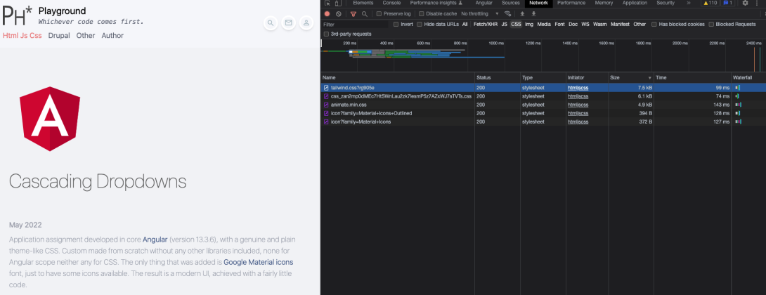
Well, this website is implementation in Drupal 10 and, thanks to its brilliant architecture and common "parent" packages such as Symfony and Twig, we know that every page, region, title, block, content parts, form, element down to form element label! and similar does or can have own Twig template. In other words, we do have ability to develop on each or any little part of the render markup, amongst the other powerful things we can do there we can also add existing CSS classes, or groups of classes that Tailwind CSS has ready for us. See more about it - Get started with Tailwind CSS.
The result is merely 190 lines of CSS for the whole theme, this includes longer doc blocks and some very usual suspects that need extra handling, as well as some "super classes" aka components definitions. Incredible fact is that we request and load total < 20kb of CSS for this whole website, as seen on the right side of the screenshot! This includes a few additional libraries (see about it in the chapter below) and Tailwind CSS itself is incredible size of < 8kb.

/* Theme's complete CSS in 190 lines */@tailwind base;
@tailwind components;
@tailwind utilities;
@layer base {
h1,
h2 {
@apply font-extralight text-4xl mb-2 opacity-60
}
p {
@apply pb-4
}
a:hover {
@apply motion-safe:animate-pulse
}
section {
@apply mb-40
}
svg {
@apply w-full h-auto
}
.form-input {
@apply max-w-max text-base text-green-pale border-b border-b-transparent border-solid bg-transparent outline-none appearance-none w-full py-2 focus:border-green-pale
}
textarea.form-input {
@apply h-auto
}
[type="submit"] {
@apply text-sm text-green-pale font-medium uppercase hover:text-white disabled:hover:text-green-pale hover:bg-green-pale hover:opacity-70 disabled:hover:bg-transparent cursor-pointer disabled:cursor-not-allowed opacity-100 disabled:opacity-40 transition-opacity duration-500 max-w-max px-4 py-2 border border-solid border-green-pale
}
}
@layer components {
[id$="-local-tasks"] ul {
@apply list-none list-inside
}
.flex-center {
@apply flex items-center justify-center
}
.form-required::after {
display: inline-flex;
content: '*';
color: rgb(239, 68, 68);
margin-left: 2px;
}
.form-icon {
@apply max-w-max z-10 text-green-pale text-lg relative w-full basis-[10%]
}
/**
* Custom animation, "grow" with usage of pre-existing twcss classes.
* @see templates/navigation/menu--secondary-menu.html.twig for usage example.
*/
.animation-grow {
@apply transition-all duration-200 ease-linear w-56 scale-0 invisible -translate-y-2/4 translate-x-2/4
}
.animation-grow.animation-active {
@apply scale-100 visible translate-y-0 translate-x-0
}
/**
* Pane custom component, most likely "collapsible" widget.
* @see templates/navigation/menu--acount.html.twig for usage example.
* @see /modules/custom/ph_core/js/ph_collapsible.js
*/
.pane {
@apply bg-white w-max rounded-md shadow-lg z-20 p-4 mt-2 leading-8
}
.pane.no-shadow {
@apply shadow-none
}
.pane.absolute {
@apply max-w-screen-sm left-auto right-0 text-base font-light
}
.item-link {
@apply text-sm text-green-pale hover:bg-red-pale hover:text-white hover:animate-none rounded p-2
}
/**
* "Fab" custom component
* @see templates/forms/input--search-input.html.twig for usage example
*/
.fab-parent {
@apply flex items-center max-w-max justify-between space-x-2
}
.fab-wrapper {
@apply w-9 cursor-pointer rounded-full border-solid border-white border-4 text-center transition-transform delay-150 hover:scale-110 duration-300 max-w-none min-w-[2.25rem] max-h-[2.25rem] shadow-md hover:shadow-lg
}
.fab-wrapper.is-active {
@apply scale-[120%] shadow-lg
}
.fab-icon {
@apply opacity-60 text-xl text-green-pale
}
.fab-wrapper.is-active > .fab-icon {
@apply text-red-pale
}
/**
* Admin tabs
*/
.tailwind-tab a {
@apply inline-block px-4 py-2 rounded-t-lg border-solid border-b-2 border-transparent hover:text-gray-600 hover:border-gray-300 dark:hover:text-gray-300
}
.tailwind-tab a.is-active {
@apply border-blue-600 dark:text-blue-500 dark:border-blue-500
}
/**
* Highlight.js code highlighting
*/
code.hljs {
@apply font-light font-mono
}
code.hljs.code-title {
@apply opacity-60
}
code.hljs.code-title > .hljs-comment {
@apply hover:animate-pulse duration-75 text-lime-400 font-mono
}
/**
* Video play icon.
*/
.play-arrow {
@apply bg-gray-500 opacity-80
}
i.play-arrow {
left: calc(50% - 1.5rem);
}
}
/**
* "On the fly" classes, need to be defined outside of taliwindcss layers.
*/
.is-active {
@apply text-red-pale
}
.floating {
transform: translateY(-80%);
pointer-events: none;
transition: .1s;
position: absolute;
}
.ck.ck-icon,
.ck.ck-icon *,
.ck.ck-button .ck-button__label,
a.ck.ck-button .ck-button__label {
@apply text-green-pale !important
}
.ck.ck-editor__main>.ck-editor__editable:not(.ck-focused),
.ck-rounded-corners .ck.ck-editor__top .ck-sticky-panel .ck-toolbar,
.ck.ck-editor__top .ck-sticky-panel .ck-toolbar.ck-rounded-corners {
@apply border-none bg-transparent
}
.ck.ck-editor__editable.ck-focused {
outline: none !important;
background: transparent !important;
border: none !important;
box-shadow: none !important;
}