Being a hot topic for quite a while, Tailwind CSS caught my eye, especially because I've been fairly familiar with usage and implementation of similar libraries and/or frameworks. At some point, a few years ago I also ended up making my own CSS masterclass from scratch - defining a lot of generic CSS classes that will be applied and re-used just everywhere in templates. However, Tailwind CSS does it the best!
Tech concept behind this website
Why previous may stand as a modern approach?
Well, this website is implementation in Drupal 10 and, thanks to its brilliant architecture and common "parent" packages such as Symfony and Twig, we know that every page, region, title, block, content parts, form, element down to form element label! and similar does or can have own Twig template. In other words, we do have ability to develop on each or any little part of the render markup, amongst the other powerful things we can do there we can also add existing CSS classes, or groups of classes that Tailwind CSS has ready for us. See more about it - Get started with Tailwind CSS.
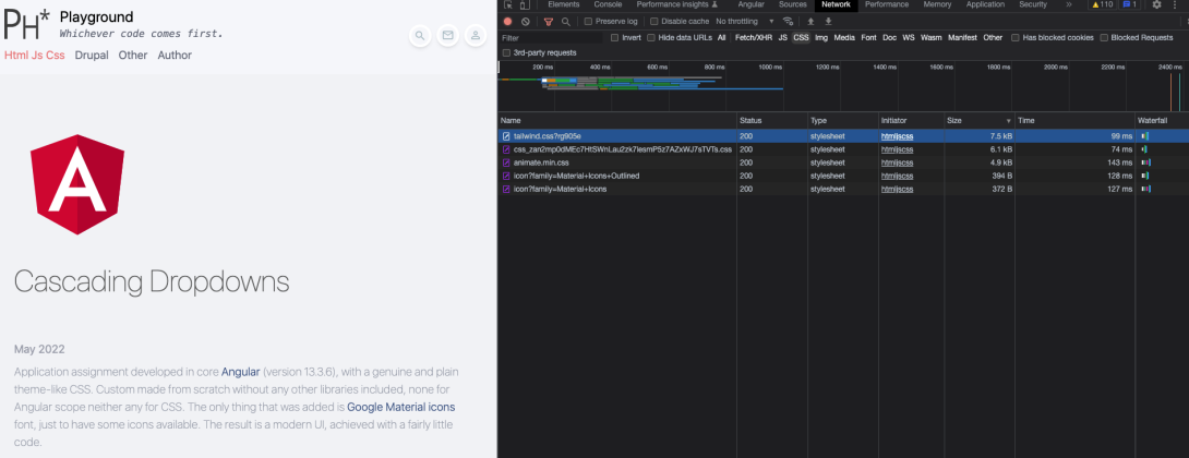
The result is merely 190 lines of CSS for the whole theme, this includes longer doc blocks and some very usual suspects that need extra handling, as well as some "super classes" aka components definitions. Incredible fact is that we request and load total < 20kb of CSS for this whole website, as seen on the right side of the screenshot! This includes a few additional libraries (see about it in the chapter below) and Tailwind CSS itself is incredible size of < 8kb.
/* Theme's complete CSS in 190 lines */
@tailwind base;
@tailwind components;
@tailwind utilities;
@layer base {
h1,
h2 {
@apply font-extralight text-4xl mb-2 opacity-60
}
p {
@apply pb-4
}
a:hover {
@apply motion-safe:animate-pulse
}
section {
@apply mb-40
}
svg {
@apply w-full h-auto
}
.form-input {
@apply max-w-max text-base text-green-pale border-b border-b-transparent border-solid bg-transparent outline-none appearance-none w-full py-2 focus:border-green-pale
}
textarea.form-input {
@apply h-auto
}
[type="submit"] {
@apply text-sm text-green-pale font-medium uppercase hover:text-white disabled:hover:text-green-pale hover:bg-green-pale hover:opacity-70 disabled:hover:bg-transparent cursor-pointer disabled:cursor-not-allowed opacity-100 disabled:opacity-40 transition-opacity duration-500 max-w-max px-4 py-2 border border-solid border-green-pale
}
}
@layer components {
[id$="-local-tasks"] ul {
@apply list-none list-inside
}
.flex-center {
@apply flex items-center justify-center
}
.form-required::after {
display: inline-flex;
content: '*';
color: rgb(239, 68, 68);
margin-left: 2px;
}
.form-icon {
@apply max-w-max z-10 text-green-pale text-lg relative w-full basis-[10%]
}
/**
* Custom animation, "grow" with usage of pre-existing twcss classes.
* @see templates/navigation/menu--secondary-menu.html.twig for usage example.
*/
.animation-grow {
@apply transition-all duration-200 ease-linear w-56 scale-0 invisible -translate-y-2/4 translate-x-2/4
}
.animation-grow.animation-active {
@apply scale-100 visible translate-y-0 translate-x-0
}
/**
* Pane custom component, most likely "collapsible" widget.
* @see templates/navigation/menu--acount.html.twig for usage example.
* @see /modules/custom/ph_core/js/ph_collapsible.js
*/
.pane {
@apply bg-white w-max rounded-md shadow-lg z-20 p-4 mt-2 leading-8
}
.pane.no-shadow {
@apply shadow-none
}
.pane.absolute {
@apply max-w-screen-sm left-auto right-0 text-base font-light
}
.item-link {
@apply text-sm text-green-pale hover:bg-red-pale hover:text-white hover:animate-none rounded p-2
}
/**
* "Fab" custom component
* @see templates/forms/input--search-input.html.twig for usage example
*/
.fab-parent {
@apply flex items-center max-w-max justify-between space-x-2
}
.fab-wrapper {
@apply w-9 cursor-pointer rounded-full border-solid border-white border-4 text-center transition-transform delay-150 hover:scale-110 duration-300 max-w-none min-w-[2.25rem] max-h-[2.25rem] shadow-md hover:shadow-lg
}
.fab-wrapper.is-active {
@apply scale-[120%] shadow-lg
}
.fab-icon {
@apply opacity-60 text-xl text-green-pale
}
.fab-wrapper.is-active > .fab-icon {
@apply text-red-pale
}
/**
* Admin tabs
*/
.tailwind-tab a {
@apply inline-block px-4 py-2 rounded-t-lg border-solid border-b-2 border-transparent hover:text-gray-600 hover:border-gray-300 dark:hover:text-gray-300
}
.tailwind-tab a.is-active {
@apply border-blue-600 dark:text-blue-500 dark:border-blue-500
}
/**
* Highlight.js code highlighting
*/
code.hljs {
@apply font-light font-mono
}
code.hljs.code-title {
@apply opacity-60
}
code.hljs.code-title > .hljs-comment {
@apply hover:animate-pulse duration-75 text-lime-400 font-mono
}
/**
* Video play icon.
*/
.play-arrow {
@apply bg-gray-500 opacity-80
}
i.play-arrow {
left: calc(50% - 1.5rem);
}
}
/**
* "On the fly" classes, need to be defined outside of taliwindcss layers.
*/
.is-active {
@apply text-red-pale
}
.floating {
transform: translateY(-80%);
pointer-events: none;
transition: .1s;
position: absolute;
}
.ck.ck-icon,
.ck.ck-icon *,
.ck.ck-button .ck-button__label,
a.ck.ck-button .ck-button__label {
@apply text-green-pale !important
}
.ck.ck-editor__main>.ck-editor__editable:not(.ck-focused),
.ck-rounded-corners .ck.ck-editor__top .ck-sticky-panel .ck-toolbar,
.ck.ck-editor__top .ck-sticky-panel .ck-toolbar.ck-rounded-corners {
@apply border-none bg-transparent
}
.ck.ck-editor__editable.ck-focused {
outline: none !important;
background: transparent !important;
border: none !important;
box-shadow: none !important;
}
How does that work with Drupal?
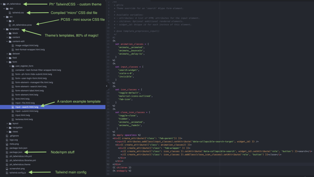
This theme, entitled Ph*TailwindCSS was made from scratch, literally grounded on Drupal's core base Stable theme. Here is a draft preview of Twig templates created within, apart from the other logic and layout definitions that may be found there, those contain existing Tailwind CSS classes applied and that's 80% of magic so far!
For a quick view on classes usage here is a minimum Twig/HTML that creates main page template.
/* Main page template "page.html.twig" */
{%
set header_classes = [
'bg-slate-50/70',
'backdrop-blur-lg',
'sticky',
'top-0',
'p-4',
'mx-auto',
'z-10',
]
%}
{%
set main_classes = [
'blur-sm',
'container',
'my-16',
'mx-auto',
'px-4',
]
%}
{%
set footer_classes = [
'h-16',
'bg-slate-50/70',
]
%}
{# Sticky header #}
<header{{ create_attribute({'class': header_classes}).setAttribute('role', 'banner') }}>
<div class="container mx-auto lg:px-4 flex content-between place-content-between items-center space-x-2">
<div class="flex flex-col space-y-2 lg:space-y-0 lg:flex-row lg:basis-full lg:space-x-12 lg:items-center">
{{ page.header }}
</div>
{% if page.header_right %}
<div class="flex items-center justify-end space-x-2" data-collapsible-parent-id="nav_right">
{{ page.header_right }}
</div>
{% endif %}
</div>
</header>
{# Main loading spinner #}
<div data-spinner="main" class="animate__animated container mt-2 mx-auto px-4 text-green-pale opacity-60">
<svg class="absolute animate-spin -ml-1 mr-3 w-6 h-6 text-green-pale" xmlns="http://www.w3.org/2000/svg" fill="none" viewBox="0 0 24 24">
<circle class="opacity-25" cx="12" cy="12" r="10" stroke="currentColor" stroke-width="4"></circle>
<path class="opacity-75" fill="currentColor" d="M4 12a8 8 0 018-8V0C5.373 0 0 5.373 0 12h4zm2 5.291A7.962 7.962 0 014 12H0c0 3.042 1.135 5.824 3 7.938l3-2.647z"></path>
</svg>
</div>
{# Main container #}
<main{{ create_attribute({'class': main_classes}).setAttribute('role', 'main') }}>
<a id="main-content" tabindex="-1"></a>
{{ page.help }}
{{ page.highlighted }}
<div class="md:flex">
<div class="md:flex-1">
{{ page.content }}
</div>
{% if page.sidebar_first %}
<aside class="p-4 md:w-1/4" role="complementary">
{{ page.sidebar_first }}
</aside>
{% endif %}
{% if page.sidebar_second %}
<aside class="p-4 md:w-1/4" role="complementary">
{{ page.sidebar_second }}
</aside>
{% endif %}
</div>
</main>
{# Footer #}
{% if page.footer %}
<footer{{ create_attribute({'class': footer_classes}).setAttribute('role', 'contentinfo') }}>{{ page.footer }}</footer>
{% endif %}
JavaScript and Form API magic!
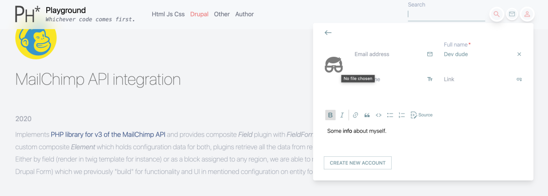
So far the biggest slice of the development cake for this website was developing widgets - 3 little bears - a custom CSS component is called Fab in the PCSS file, in the top right corner of the site. Those are complex because several, diverse scopes are involved. In the back-end it's programmatically loaded View's exposed filter as Search widget, Website contact form as entity form as well as Sign in (class to extend) and Sign up form (entity form).
See more about Drupal/PHP code in the next segment. Here's a few notes for JavaScript code that was much needed here as-a-heroine:
- Search widget tiny code.
- Custom "fancy" form elements, inputs and buttons etc. that make interaction flow, label floating and default and x close icons.
- Custom collapsible widget that can be applied elsewhere too, uses data attributes for global logic.
- Active class on Site logo's (SVG) path, loading spinner/logic - see these below in Common elements logic in JS code toggle.
- A specific JS code to make videos lazy-loaded. It seems like a good idea at the moment, in order to try to improve a page loading time and considering the fact that videos are stored as Media local videos, so not iFrame and no any player (such as videojs could be) yet - only a bare HTML5 video tag.
- Intersection Observer to follow sections (those are big) being in view and animating (fade in currently). See here.
- jQuery was intentionally skipped and around 600 lines of code in question, in total, were written pure vanilla style, actually according to the most modern Web APIs Why? Because skipping jQuery makes this code way more generic and "tune-able" into any of modern frameworks like Angular, React, Vue etc. and it seems it may have a bigger longevity/compatibility even with Drupal which is still including jQuery in the core at this point.
/* Common elements logic in JS */
/**
* @file
* Ph TailwindCss theme scripts.
*/
(function(Drupal) {
'use strict';
document.onreadystatechange = () => {
let timeout;
if (document.readyState == 'interactive') {
// Always a good idea to clear timeout.
if (typeof timeout === 'number') {
clearTimeout(timeout);
}
} else if (document.readyState == 'complete') {
// Remove blur from the <main> element.
document.querySelector('main').classList.remove('blur-sm');
// Loading spinner animation handling.
const spinner = document.querySelector('[data-spinner="main"]');
if (spinner) {
spinner.classList.add('animate__fadeOut');
timeout = setTimeout((s) => {
s.remove();
}, 1500, spinner);
}
}
};
Drupal.behaviors.phDefault = {
attach: function(context, settings) {
if (settings.path.isFront) {
// Fill star "*" path in logo svg when on front page (miming "is-active" class).
const logo = document.getElementById('site-logo');
if (logo) {
const paths = logo.children[0].children;
if (paths[1]) {
paths[1].setAttribute('fill', '#ef4444b3');
}
}
}
}
};
})(Drupal);
/* Search widget JS */
/**
* @file
* Ph* search widget.
*
* @ingroup Ph* core scripts.
*/
(function(Drupal) {
'use strict';
Drupal.behaviors.phSearch = {
attach: function(context, settings) {
const searchInputs = [].slice.call(context.querySelectorAll(
'[data-collapsible-search-target]'));
searchInputs.forEach(input => {
const collapsibleId = input.dataset.collapsibleSearchTarget;
if (collapsibleId && context.querySelector(
'[data-collapsible-search=' + collapsibleId + ']')) {
const toggle = context.querySelector(
'[data-collapsible-search=' + collapsibleId + ']');
if (toggle) {
let timeout;
toggle.addEventListener('click', event => {
event.preventDefault();
// Do out custom "grow" animation here.
// It works with the following Tailwind classes.
input.classList.toggle('scale-x-0');
input.classList.toggle('scale-x-100');
input.classList.toggle('invisible');
input.classList.toggle('visible');
// Take care of the siblings, being part of the same wrapper in DOM.
if (Drupal.behaviors.phDefault) {
const collapsibleParentId = event.currentTarget.dataset
.collapsibleParent;
let parent = collapsibleParentId ? context.querySelector(
'[data-collapsible-parent-id="' +
collapsibleParentId + '"]') : event.currentTarget
.parentNode.parentNode;
Drupal.behaviors.phDefault.siblings(event.currentTarget,
parent, '[data-collapsible]', {
'class': 'is-active',
'op': 'remove'
});
}
// Drupal's "is-active" class.
event.currentTarget.parentNode.classList.toggle(
'is-active');
// Focus on this search input after a while.
if (input.classList.contains('scale-x-100')) {
timeout = setTimeout((element) => {
element.focus();
}, 600, input);
} else {
// Always a good idea to clear timeout.
if (typeof timeout === 'number') {
clearTimeout(timeout);
}
}
});
// Always a good idea to clear timeout.
if (typeof timeout === 'number') {
clearTimeout(timeout);
}
}
}
});
}
};
})(Drupal);
0% hardcode
Currently this website is based on Drupal 10, it is mostly core with only a few usual must-have modules: Devel, Paragraphs, Token, Pathauto, Search API, Entityqueue, Svg Image, Field Group, Memcache API Integration and Gin Admin Theme. That would be all on top of the core, to work along smooth with this specific front-end solution. You can check composer.json file that is part of repository for a better overview. Additionally, we do implement CKEditor 5 (still experimental in Drupal core at the moment) that is just awesome! You can see it on Sign up form.
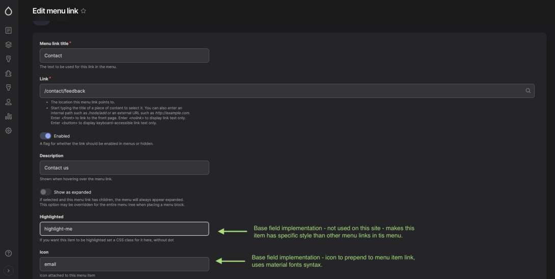
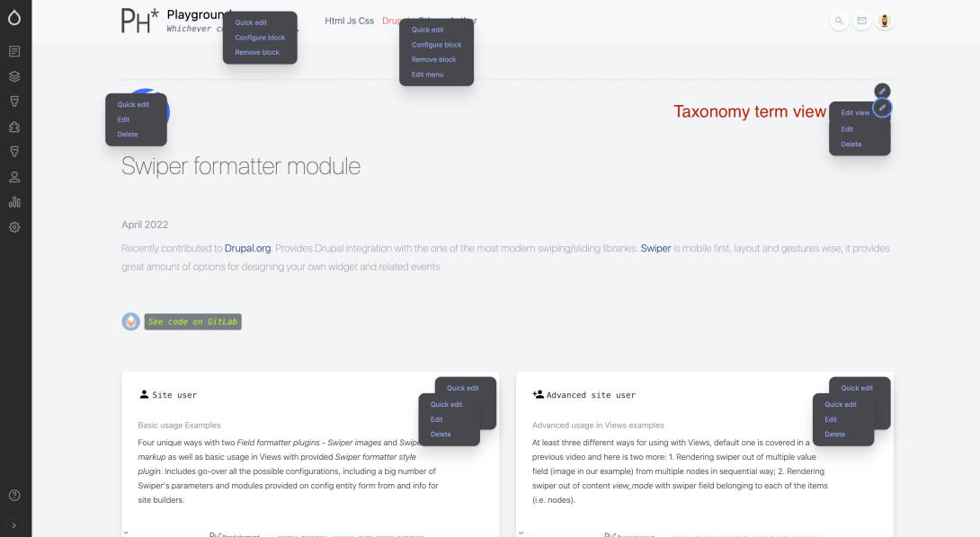
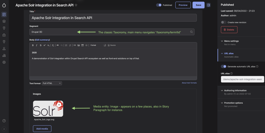
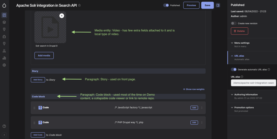
So all Drupal entities and the classic structure is the case here, even assets like logo images that are mostly SVG are parts of Media entities and registered in the system and loaded default way. There is no single item or protocol in the config and code here that could be out of most strict Drupal standards. Here is a few screenshots from this website admin UI.
Yet, there is a little more
This website is using slightly more of a front-end, sort of essential-yet-minimal. First of all there is official Tailwind CSS plugin Typography (requirement to be found in package.json file). There is only a few plugins defined as official and this one is a brilliant solution for covering a gap with a rich text that is coming from database (so no file scanning by Tailwind mechanism possible to generate classes needed), such as exactly this very text that comes from rich text field with Full Html filter.
Then Google's Material Icons library is also loaded, just to have some icons around, loaded as font for now and included in the theme as library with external property (from cdn).
As well as Animate.css mostly because this is super tiny and plain + solid CSS for some typical (or enough of) animations. Tailwind is not providing as much as ready-made animations which after all actually does make sense because with transition/transofrm and other properties that it is providing it should be already whole a lot of scope + is pure.
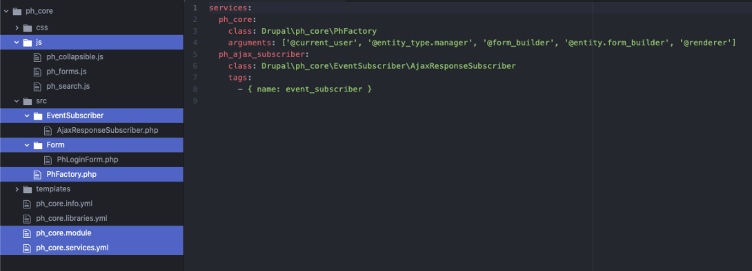
A "support" by custom module was required so I wrote one named Ph* core. The module is enclosed in the repository. Specifically it serves for a development of a set of very custom widgets (see in the previous section about these), as well as for definitions of some child PHP classes, in the best OOP manner with current Drupal. For fellow Drupalers it is known why/how theme and module are differently designed as code providers, some type of code is exclusively for modules, some configs and code organization are meant for themes etc.
See screenshot under, basically with this module we are:
- In order to ultimately follow Drupal's architecture and best practices, some scripts are attached in appropriate points of code flow and therefore these "live" in the module and not in the theme.
- We are hooking up (subscribing) on AjaxResponse - for the moment exclusively for user/login form to work, last badge in the top right corner of this site.
- Extending Drupal's login form PHP class in order to turn it into ajax form.
- Defining site-wide available Drupal service with PhFactory class, cca 300 lines for various "hardcore" stuff.
Additionally, this module implements extra base fields on menu_link_content entity, which is probably the only entity in core Drupal that is not yet field-able via UI but works with adding it in the hook_entity_base_field_info() module's code. See under how we defined two very special fields for each menu link, Icon field in order to "attach" icon to it in twig template ("email" in this example) and Highlighted field to have it has different CSS style than other menu links from that menu (ever had client asking you exactly this? :)
Caveats
Tailwind engine is processing Twig templates by parsing twig files directly and does not bootstrap anything on the backend side (Drupal in this case) hence it cannot "process" variables that are either set in Twig templates or in hook_template_preprocess_HOOK() hooks or similar code where values are generated "on the fly". Here is the example code, what's in Twig expression below for the first class in wrapper_classes[] array will not work, despite the fact that "max-w-[arbitrary_value]" is perfectly applicable by Tailwind CSS design, actually any property can be be defined as an arbitrary value. Simply, variable first_width generated this way in the Twig template is unknown to Tailwind.
{% set first_width = items[0] and items[0].field_width ? items[0].field_width %} {% set wrapper_classes = [ /* This one will not work! */ first_width > 0 ? 'max-w-[' ~ first_width ~ 'px]' : 'max-w-fit', /* The following 3 will work as designed. */ 'flex', 'flex-wrap', 'space-x-4', ] %}
Similar is and example with preprocess hook, Tailwind's class text-lime-600 will be there on element's title but it will not apply because Tailwind does not read from PHP files (in this case it's ph_tailwindcss.theme php file. Unless text-lime-600 it is already in use in the DOM/markup and Tailwind was able to read it and pack it in the distribution minified CSS file. Remember, one of the best features of Tailwind is - no unused rules and properties, no extra CSS lines - it parses files per its configuration and packs only whichever classes it finds.
/** * Implements hook_preprocess_HOOK(). */ function ph_tailwindcss_preprocess_input(&$variables) { if (isset($variables['element']['#title'])) { /* This will not work! */ $variables['title_attributes']['class'][] = 'text-lime-600'; } }
Fun fact - it is relatively easy to "hack" the outcome. Just to register text-lime-600 and have Tailwind to have it packed in distribution file, somewhere in the Twig template in relation to this case or similar say we could put a dummy element:
<div class="text-lime-600 hidden"> </div>
Of course this is far from elegant and not recommended, especially because I believe that we might get some kind of mechanism to resolve these situations.
Same is for interactivity in JavaScript, for instance when we are applying or removing some class or attribute on some element, on some event (i.e. click), such generic property - like for instance floating class like in the example below - its properties will needed to be added in the same source PCSS file, but the classic way, out of layers and directives. However that is still a solid remedy, especially for some usual suspects like CKEditor that processes and generates a lot of stuff upon page loading etc.
switch (event.type) { case 'focus': if (label) { /** This class was NOT found by Tailwind while parsing templates, * it is set dynamic here in JS and will need to be added as a * "classic" CSS with its rules/specifics. */ label.classList.add('floating'); } break; ...
# TODO
- Upgrade this website actually to Drupal 10!
- Fill in all the missing content / images and check on language and spelling on all posts.
- Document JS code.
- Implement Search widget, with Search API, actually returning autocomplete results.
- Define and style Reset password forms.
- Clean up hljs warnings Html::escape does NOT work atm!
- Side navigation with #anchor links to sections on front page.
- Load user forms and contact form via Ajax.
- Move to NGINX server.